Looking at 25 years of the Working Design visual identity
Developing logos, graphic identities and helping clients with their branding are among our favourite projects at Working Design. Whether it’s for a research institute, a social service agency or a business, the process of defining a look, an online presence and who you are in your sector, the process is the same.
The job can be more challenging, however, when the client is…yourself. Working Design is constantly evaluating our role and identity, and refining our online presence and marketing. In the past few months we’ve launched a redeveloped website, expanded our social media presence through Twitter and Facebook and, finally, printed new business cards.
When the latest batch was delivered last week it was time to clear out a few boxes of the old ones. In looking at them, we saw our history in a nutshell. In 25 years we’ve gone from a cut-and-paste print design studio to a completely computer-based operation working almost equally in web development and print material design.
Our first card from the 80s uses a found graphic depicting a workers’ hand turning a wrench. Wrenches – and later, cogs – are ongoing themes in our identity work.
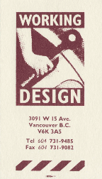
Our next card features a bolder design, more dramatic use of colour with updated typography (the beautiful Rotis Serif) and an enlarged version of the same graphic.
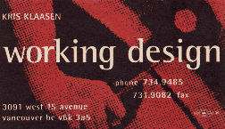
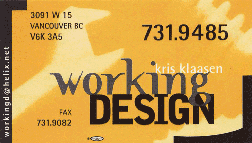
Card number three from the mid-90s leans towards the grunge look and uses the new rules of text juxtaposition and sequence promoted by designers like David Carson. It uses shadowgram images and a dramatic, contemporary –for its time– use of typestyles and colour.
In the early 2000s we developed our first website and became more marketing savvy. We introduced our tagline – “working (at more than) design” developed by our freind and colleague , Bill Tieleman from West Star Communications. Also we indicate our main areas of work: ideas, graphics, communication. We market-tested design and colour options and our survey group clearly favoured a cool blue card with chartreuse-coloured letters. In addition, this card followed the trend towards two-sided presentations made necessary to include the increased information of email addresses, website url, cel phone numbers as well as all the other stuff.
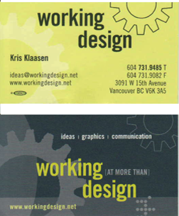
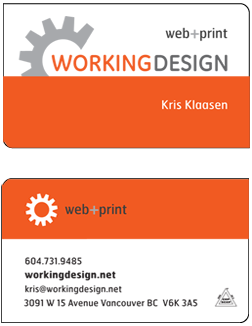
Fast forward to 2011 and we have a simplified, open design. In today’s crowded information environment, it’s even more critical to get to the point quickly, stand out and be visually accessible. We think we’ve done that. What do you say?
Also, check out our tip sheet on branding and developing logos
And, for examples on some of our identity jobs have a look at our portfolio.
