Starting your web project: The content stage

After you’ve answered the nine key questions raised in Part 1 of our Starting a Website Project series, it’s time to think about content: text, images and quite a bit more.
Here’s your checklist:
- Content Inventory
- Special Functions
- The Content Outline
- The Visual Identity
- Site Navigation
Start by making a detailed content inventory of everything you want to include on the site. What’s required to tell your story and get results?
Your inventory will be unique to your business and site goals. It will be tailored to relay key messages to your main audiences.
Here are some examples of what it might contain:
- narrative text explaining the benefits of your organization / product / business plus your services, your people
- calls to action, quotes and testimonials, blog posts, news, events, program descriptions, and a search function
- images (both photos and illustrations) and image galleries
- information graphics, charts or tables,
- calendars, shopping carts or donation portals, video or audio, Twitter feeds, user signup forms, feedback forms
- integration with various third party services, such as membership management, Customer Relationship Management (CRM), e-commerce sites.
- a library of publications or resources organized and searchable by categories
When you’re making the list, don’t worry about where everything will go. Use this phase to brainstorm. Note every conceivable item that can, should or could be included, and all the different ways it could be presented.
Videos, information graphics, clickable buttons and blog entries are different ways of conveying your message. See how other sites do it, what techniques appeal to you, and what will connect best with your audience.
When all that’s done, you’re ready for the next critical phase: organizing the inventory into a comprehensive content outline.
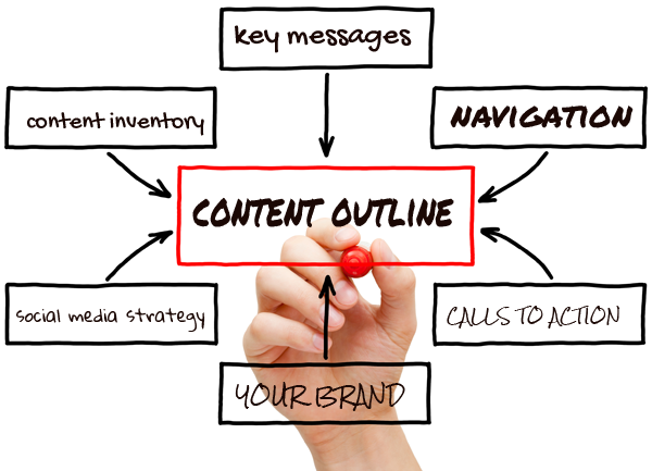
The Content Outline
A good website gives your audience what it’s looking for while letting them know what’s important and useful about you.
Your content outline puts all this together in a series of logically structured sections which make it easy for your readers to find what they are looking for and lead them to what you would like them to know and do.
The site content and structure will mirror your organization and its goals. It will ensure that your key messages and calls to action are visible and obvious to the distracted viewer. Your primary services, products and offers will be immediately accessible.
Every page of your site must direct visitors to another page or action leading to one of your desired outcomes. Those could be a donation request, a subscription sign-up, a sale or a phone call. Each page needs to be carefully considered.
One tip to keep in mind is to think like a user. What will your typical member, client, or visitor want from this site and how will they find it right away?
Site Navigation
The site’s top level categories will run in a lean and well-crafted menu bar that will appear on each page. Don’t run a dozen items here. Too many sites have so many menu items that it’s hard for users to make a choice on what to click. That won’t work well. You could lose the visitor before they even start.
Keep the options as simple and direct as possible. If you have detailed information, place it in subcategories (or subpages) of the main entries.
Your site and its content should be easily scannable. Web readers browse. They’re far less likely than print readers to read much of your content especially when they first land on your site.
Keep in mind the three kinds of readers your site needs to address:
- the scanners,
- casual readers, and
- the committed.
Your content outline (and how you ultimately present your content) needs to have something for everyone. However, a significant portion of your visitors will be scanners.
Special Functions
In addition to text and images, there are a range of content features you might need that will make your site useful and engaging. Elements could include a publications library, a calendar, a shopping cart, donation area, a password protected zone, a search field or a member signup. You might also require third party services to be integrated onto your site such as a Twitter feed, YouTube video or a Flickr photo stream.
The Visual Identity
The way your site looks – what’s called the visual interface or graphic user interface – is the first thing users will notice. Make it good! Readers take nanoseconds to decide if they like what they see or not. Their decision can be the difference between gaining a new customer, member, client or not.
Your visual identity will be based on the range of decisions that have been made about the site’s structure and what needs to be included. The visuals – the logo, banner, typestyles, images and colours – can be based on your existing brand elements or they may involve something entirely new.
Using images The web is a visual medium. Readers are less likely to read and more likely to look.
Your images and the information they contain are an important way to tell your story. They should do more than simply support the narrative content. They need to inform and convey your message.
Consider using one or all of the following: photos, illustrations, infographics, clickable buttons, innovative wayfinding devices and so on.
When thinking about what visuals to use, ask yourself what kind of images will best present and support your themes? If readers simply scan through the pages of your site, what information will they get from the photos, illustrations and other images?
Get Started!
Once you’re done thinking about all of the things mentioned in this blog, you’re ready to start working on your site! You’ve laid the foundation for the project and now it’s time to start gathering content and shaping it into an effective and elegant communications tool.
Writing text will be one of your main activities. That’s another story. Check out the next entry in our series, “Eight key tips for writing superior website content.”
This post is Part Two of our downloadable guide to developing your website, “Starting your website project.”
