Kiwassa Neighbourhood House
To mark its 50th anniversary we rebranded Kiwassa Neighbourhood House with a new logo, tagline, print materials and website.

“We are truly thrilled with the process and results of working with Kris Klaasen and the team at Working Design on our project to completely redesign and build Kiwassa Neighborhood House’s brand and communication materials. People love our new logo, website and communication materials, describing them as beautiful, wonderful, clear and very user friendly.
Very important to us, Kris helped our non-profit agency build our capacity to develop our messages and materials in-house, using templates they created.”
—Nancy McRitchie, Executive Director, Kiwassa Neighborhood House
Project
Kiwassa Neighbourhood House is a community-based, non-profit resource and activity centre located in Vancouver’s socially diverse Hastings-Sunrise neighbourhood. It provides a broad range of accessible programs for children, youth, families, seniors and adults, and volunteer and leadership opportunities. Kiwassa needed a new visual identity for a range of print materials, and an attractive, comprehensive website.
Purpose
Kiwassa requires a visual identity that expresses its community roots and appeals to its wide ranging audience. The website must foreground Kiwassa’s numerous programs and services, appeal to a range of literacy and language levels, and be easy for staff to update regularly. As many members are not online, Kiwassa also needs to produce a range of promotional print materials.
Audience
- Seniors, parents, adults and teens seeking resources and activities
- Community members with English as an additional language
- Community members with literacy barriers
- Community service providers and referring agencies
- Government and private funders
Objectives
The identity and website development should:
- create a fresh, appealing and identifiable image for Kiwassa in the community
- develop an attractive and functional website that can present and manage a large amount of program, service and event information
- engage a socially and culturally diverse audience
Definable Goals
- develop an easy-to-update website
- build website maintenance capacity in office staff
- be able to direct clients to an information-rich online resource
- develop a series of print material templates which staff can update in-house
- assist in the development of a new tagline for the organization
Challenges
- working within a broad consultative process between staff, board, committee members
- helping to improve the design and web vocabulary of Kiwassa staff
- delivering results within the limited budget of a non-profit society
- meeting the needs of a socially diverse audience
Applications
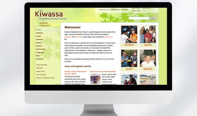
The new visual identity was applied to the website, and used to design a visual interface that integrates the graphic themes and colour palette.
It is also applied to print collateral (brochures), identity materials (business card, letterhead) and signage. Design templates were generated so that staff can create new posters, newsletters, and signage in-house.
Process
Discovery
This process involved working with the Executive Director and committee members, and comprised two phases: identifying a direction for a visual identity, and then determining the organization’s communication and service delivery needs.
As it was planning a community garden on its grounds, Kiwassa was clear that it wanted a visual identity that suggests growth, renewal, and community roots. And it needed a website that highlights and serves Kiwassa’s primary function — the effective delivery of activity programs, support groups and resources to the public.
Concept Development
We collaborated with the client to evolve a colour palette for the logo, and expanded the “growth” metaphor on the website with imagery of leaves and grass. The tagline “Growing Community” emerged from this process.
It’s important that visitors arriving on the website see themselves reflected in the array of images and services provided. The site focuses prominently on Kiwassa’s community programming, offering multiple points of entry for each user group and showing images of the centre’s diverse audience.
Implementation
It is important to Kiwassa that their office staff be able to keep the web content fresh. We used the popular and accessible WordPress content management system (CMS), which permits staff to add and change web content easily.
The client generated all of the text and images. They collected and took photos of centre events, clients and activities, avoiding the use of stock photography.
The end result is an identity and a website in which Kiwassa was involved and engaged at all levels of development.
