The Vancouver Aquabus

Project
The Vancouver Aquabus provides commuter ferry services throughout Vancouver’s False Creek, as well as tourism services such as charters and mini-cruises.
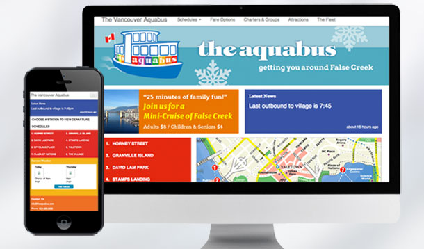
Our main objective in creating a new web presence for The Vancouver Aquabus Ltd. was to present them with a fresh, modern look and feel, and to deliver an enhanced mobile experience for their ridership with a focus on the tourism sector, which accounts for roughly 60 per cent of their customers.
Goals
- Promote The Aquabus as urban transportation, and as a tourist attraction.
- Present schedules and fares in a comprehensive and easy to read way.
- Promote attractions around the various Aquabus stations as incentives to use the service.
- Optimize website for use with mobile devices.
- Establish The Vancouver Aquabus as an official transit provider for integration into the Google Maps Transit service.
Challenges
- Design a new responsive website which displays targeted information to users of standard web browsers, tablets, and smartphones, without creating multiple websites.
- Understand the three Aquabus routes, all possible connections between routes, and distances between all Aquabus stations in order to develop schedules for each station.
Process
Discovery
We reviewed the existing Aquabus site, as well as that of their main competitor. We identified key brand elements which clearly identified The Vancouver Aquabus to its existing customers and to potential new riders.
Aquabus staff helped us to gain a comprehensive understanding of all their routes and schedules. This was critical to building the schedule tables for each station.
Concept Development
With the specific goals of increasing the number of tourists using the system, while better serving the core commuter ridership of The Vancouver Aquabus in mind, we simplified the site’s marketing focus. We built a new content structure for the website which satisfies the refocused marketing goals.
The content structure was streamlined to bare essentials for use on mobile devices.
Implementation
It was clear that a mobile-friendly website design would best serve The Aquabus’s core commuter ridership as well as reach its tourist base. With this in mind, we built the website using the responsive website paradigm.
In order to speed up the development process, we leveraged the Bootstrap Framework developed by Twitter. The Bootstrap Framework facilitates a grid-based layout using HTML5 standards.
Conclusion
The new site has been well received. Its look and initiatives are acting as a springboard for the development of new signage and other marketing. Take a look.
