Social housing
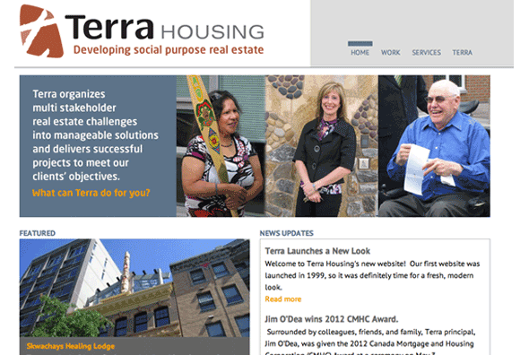
Terra Housing Business website
- Project Business website
- Client Terra Housing
- Client Since 2009
- Sector Social housing
A changing business environment was the main impetus for Terra Housing to redevelop its website and rebrand its identity. At the same time the company wanted to update its in house systems to incorporate new tools and technologies. And it wanted to engage clients in a collaborative online project management system through an intranet as part of its online retooling.
URL: terrahousing.ca

Terra Housing Identity
- Project Identity
- Client Terra Housing
- Client Since 2009
- Sector Social housing
The Terra logo uses a rough, angled lowercase letter ‘t’ to symbolize the organization’s hands on project style. The asymmetrical spaces carved by the letterform suggest a dynamic division of land while the white space maps a path and direction. The overall rounded, organic shape reflects the flexible and accessible process Terra engages in with its diverse range of clients.

